Clearly,
December 29, 2021
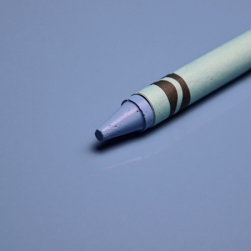
with all that’s going on in the world….yes, more bad news. We have apparently run out of colors! Imagine that. Which brings me to Very Peri, Pantone’s pick for color of the year 2022. Very Peri, a color that the Pantone Color Institute created specifically for this annual honor. Didn’t we already have a Periwinkle? I thought we did. And, if memory serves, it was a distinctive member of the Crayola collection for decades. Will we be seeing this ” new ” shade everywhere next year? Who knows. My guess is that it will follow in the footsteps of Pantone’s flop of 2015…Marsala. Remember that dud?

If you’d like to learn more about Very Peri, read the words of Leatrice Eiseman, extolling the qualities of this new hue. Fair warning…it’s a snooze fest. https://www.pantone.com/color-of-the-year-2022
Very Peri photo: Pantone.com
Crayola Periwinkle photo: ColumbiaCoatings.com
If you’d like to revisit Marsala…https://simplequietmodern.com/2014/12/18/marsala-a-swing-and-a-miss/
January has been brought to you…
January 29, 2017
by the color gray. While I couldn’t be more pleased with our relative lack of snow, it would be nice to see some sun. Morning, noon and night have all been so gray…DARK gray…for what seems like the entire month. A little blast of natural vitamin D would be welcome. Until the skies clear it might be a good idea to fill some vases with daffodils or forced forsythia branches, tuck a bright paint chip among your currency for a little pop of bright as you go about your day or hunker down to an afternoon of binge-watching Versailles on Netflix and seeing what the Sun King is up to. I’m going for all three.
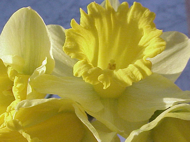

Top to bottom:
image: gp
image: Pantone.com
image: Netflix
