Really, is this the look
October 24, 2012
you’re going for? Thanksgiving will be here before you know it and you will be entertaining family and friends with 2 bare wires sticking out of your dining room ceiling… still. Pretty. Why is making this decision so hard when there is a simple solution…a George Nelson Bubble Lamp. Classic, simplequietmodern (since it’s introduction in 1947) …and available in enough shapes and sizes to be the perfect lighting selection for a dining room of any size or style direction. Get the scale right and the quiet statement will be deafening. So there you have it, decision made.

http://hivemodern.com/pages/product951/modernica-nelson-bubble-xl-bell
Commitment issues?
October 9, 2012
No need…even if the seasonal forecast is eye-popping. When planning a living space keep it simple by choosing pieces you love and working the “givens” in such a way as to amplify their appeal. This floor for instance…classic walnut herringbone. Old, worn, patinaed…a perfect backdrop for the classic Eames shell chairs around a simple planked table lit with another mid-century classic, the PH4/3 designed in 1966 by Poul Henningsen. Important here is the selection of finishes…pale, clean, neutral…whites and mixed tonal woods…just waiting to be punctuated with a selection from the Pantone Fashion colors for Fall 2012. Add any one shade for a time…in the form of accessory. A bowl of gold ornaments and large brown pinecones, some lavender glassware…maybe a hot pink runner or napkins…all can add the fashion spark temporarily and cost-effectively…freeing you from any expensive long-term color commitment. When I see this pink it brings to mind the words of fashion icon Diana Vreelend. ” I love this pink. It’s the navy blue of India.” Which of these ten colors will you be adding…and how?
http://hivemodern.com/pages/product3603/herman-miller-eames-dsw
zzzz…zzzz…zzzzzzzz….
September 7, 2012
Good sleeping weather aside, there is nothing like a simple, quiet place to catch some Z’s and refresh yourself in preparation for tomorrow’s adventures. This simplequietmodern bedroom has all that I need. From its calming palette to its simplicity of design, it welcomes you to curl up with a chapter or 2 before nodding off. Again, my “Five Easy Pieces” is all that is needed to make this plan work for you; 1) the headboard 2) the lighting 3) mattress and simple linens 4) night table and 5) a blanket, coverlet or quilt. Any of these elements can be adjusted to more perfectly suit your individual style as long as you keep in mind the part each plays in the overall design. Replacing the Moroccan table with a more organic slice of tree trunk or changing out the quilt with something solid or a pattern more suited to your taste can be done ,when approached carefully, without compromising the original design statement as illustrated here. The table is still round, playing up the low angularity of the headboard, and the hand-knit blanket adds a complimentary texture while it injects a jolt of color to the deeper neutrals. Get started now and by the time Fall officially arrives you’ll be ready to…well..call it a ….zzzzzzzz.
http://www.youaretheriver.com/search/label/design?updated-max=2012-05-11T11:19:00-07:00&max-results=20&start=20&by-date=false

It’s not art…
June 23, 2012
it’s a T.V. Come on people…enough already. What’s with hanging the flat panel television over the fireplace? It’s not a painting. It’s ill-placed for comfortable viewing. So what’s the draw? Unless you like sitting in the first row at the movie theatre I can’t imagine you sitting on your sofa, grabbing your remote and focusing your sights on a picture centered 7o” off the floor.  Exhibit A…ouch! ( Let’s leave it at the television placement for now.) A better idea is to leave the area above your mantle empty and save yourself a few trips to the chiropractor.
http://misscheekychic.blogspot.com/2011/10/age-old-decorating-question-fireplace.html
Black and white and…
May 19, 2012
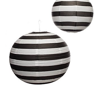
summer all over, horizontally speaking. Nothing amplifies the crisp clear sunny days of summer like black and white stripes. Indoors or out, priced high or low, there is something striped for everyone and every budget. From a Pottery Barn umbrella, custom upholstery in F. Schumacher linen. a rug from Crate & Barrel or a flotilla of paper lanterns from Z Gallerie, these bold bands of black and white will make quite the statement. If black and white is just too bold, try winding it down a bit with Black and Linen or Black and Charcoal for an equally dramatic effect. All you need now is a tall glass of sweet tea.
Plywood,concrete…
April 18, 2012
where do I sign? I L O V E this space. Maybe becuse it is not only simple, quiet and modern…but it is constructed of my all- time favorite materials; plywood and concrete. I could move in immediately…what else is there to say? http://www.narukuma.com/main.html
Until then maybe I could be happy with one of these concrete pendant lights. I already have the plywood floors.
Warm days, blue skies and cool water…
March 24, 2012
can easily become the catalyst for your next interior design project, as this lake side residence illustrates. Pulling the outdoor colors in visually expands this space, blurring the confines of walls and windows. Crucial editing of furniture and accessories keeps the room’s design lean and modern…even when occupied by family and friends, the dog and that growing pile of mail.


