Boo
October 30, 2019
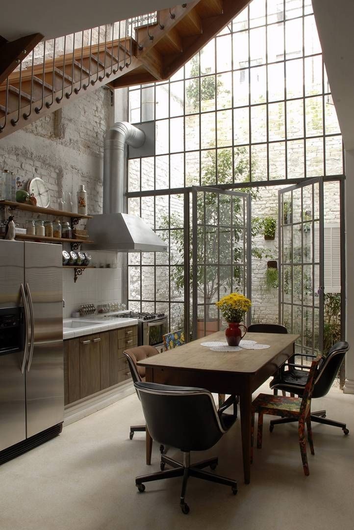
Crossing over to the dark side while I try to avoid most things Halloween and prepare for the annual “fall back” into darkness. Here are just a few simplequietmodern points of inspiration.


Top to bottom:
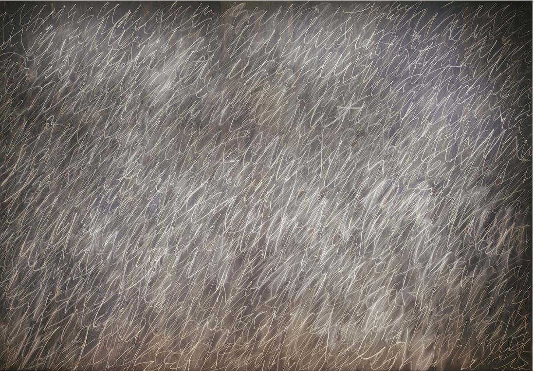
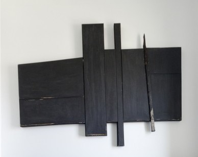
Cy Twombly, Untitled 1970 Photo: MoMA
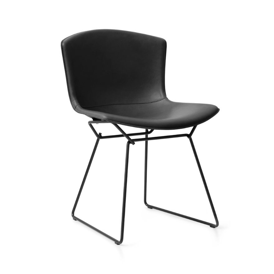
My favorite Bertoia Side Chair now available covered in leather. Photo: https://www.knoll.com/product/bertoia-leather-covered-side-chair
From Lostine…barn brooms. Or, is it a Coven parking lot? photo: https://lostine.com/collections/kitchen/products/barn-brooms
Always inspirational…the fall burn pile.
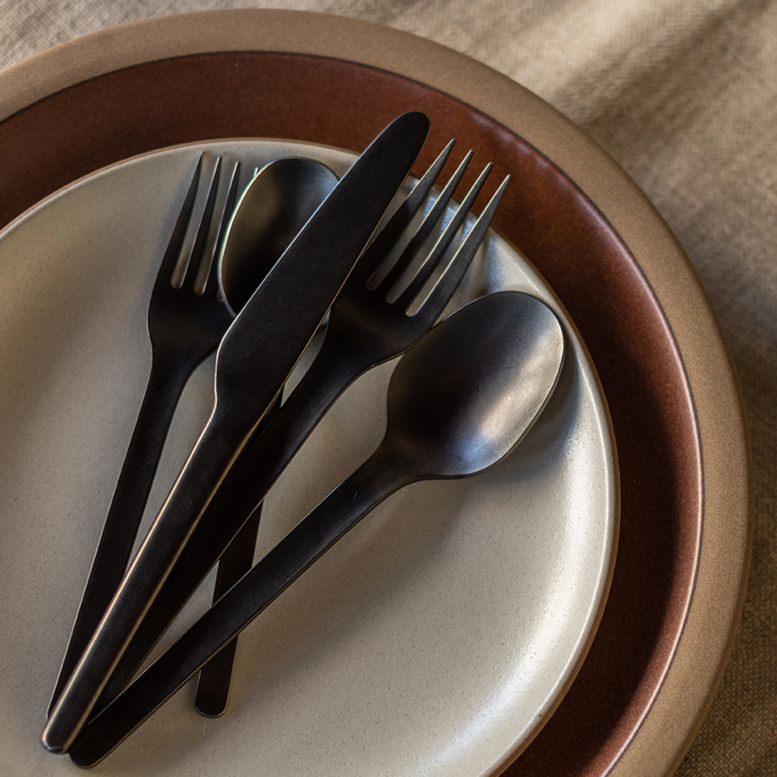
Dig in! Heath’s Muir Flatware now available in Onyx. Photo: https://www.heathceramics.com/collections/winter-seasonal-2019/products/muir-flatware-onyx-5-piece-setting-w19
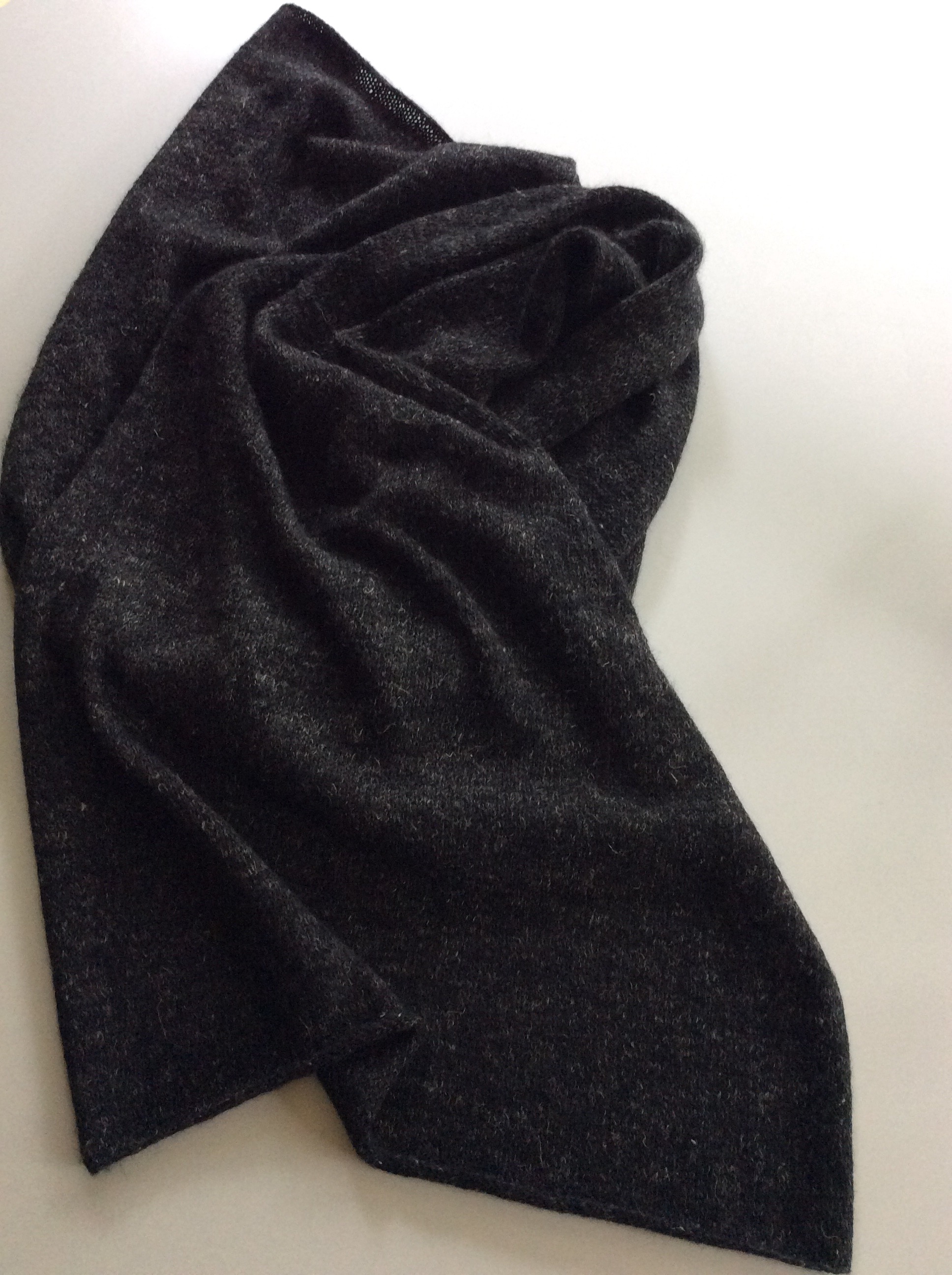
Off the sticks just in time. Purl Soho’s Elementary Wrap Knit up in their Linen Quill in Kettle Black. https://www.purlsoho.com/create/2017/10/20/elementary-wrap/
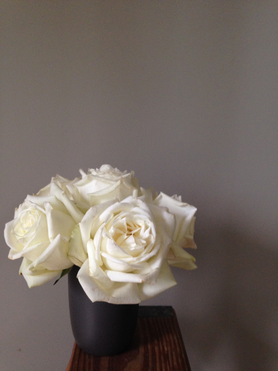
Always my favorite container for a few gorgeous blooms, the Tall Modern Cup by Heath Ceramics. Photo: https://www.heathceramics.com/products/tall-modern-cup-sand-penny-green-w19?_pos=1&_sid=d7fb13c87&_ss=r
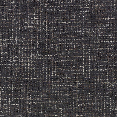
A Knoll Textiles classic, Diva… in Coal. Hmmm, what needs reupholstering? Photo: https://www.knoll.com/knolltextileproductdetail/Diva
OK…here’s just a little Halloween for ya.
Photos by GP unless where noted.
Let’s Review
January 3, 2018
Another year has passed, and with it, another year of simplequietmodern. As I prepare for year seven, I’m excited to see what held your interest over the last twelve months. The MidCentury seating of Van Keppel Green, modern black fences, the “folded” plywood works of Harry Roseman, factory inspired windows and a cozy white Christmas topped the list. Thank you for your continued interest, for stopping and sharing your kind words, for your friendship…for indulging me.


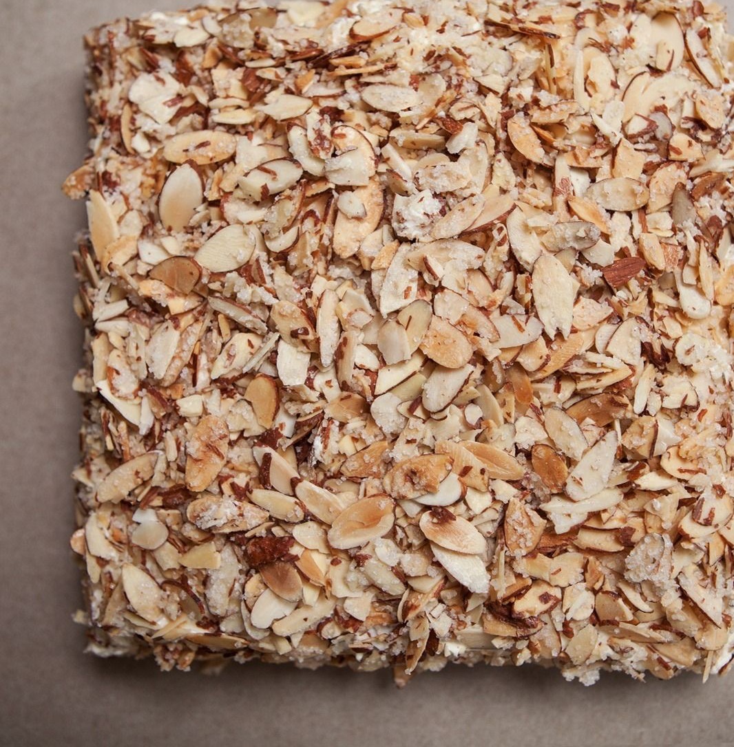
We can’t celebrate without cake, can we? I’m thinking a Burnt Almond Torte from Prantl’s Bakery in Pittsburgh might be in order. And of course, some flowers.

Top to bottom: links to each of your favorite posts:
torte photo: https://www.goldbely.com/prantls-bakery/15395-burnt-almond-torte
Still,
March 22, 2014
she continues to inspire. Modern then…modern now. Agnes Martin

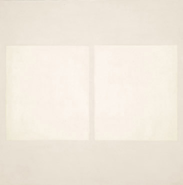

images via tumblr
Doesn’t it always come?
February 26, 2014
Spring…yes, it does eventually get here. Patience is key as Spring is officially still weeks away. This experimental watercolor by Lourdes Sanchez reminds me how faint washes of color appear through the wet melting gray that was winter. A peak of blue through the heavy skies…the pinking of buds awakening in a monotonous landscape…the slow greening of moss with the help of a little sun.

photo via: http://buysomedamnart.tumblr.com/post/68986769276/sparse-experimental-watercolors-by-lourdes
or see more of her work here:http://www.lulisanchez.com/home
It all comes down to…
October 9, 2013
black. Every room needs a little punctuation and a stroke of black just simply does the trick. That said, it’s important to give it some carefull consideration for the maximum effect. Used sparingly yet scaled generously creates focus and a juxtaposition of styles shows every other piece in the room in a new light. So, if you’re looking to shake things up, you might consider what the exclamation point called black can do for your space.


Top to bottom:
The Charleston mirror by oomph , a great interpretation of a Chippendale classic, will boldly bridge that gap between traditional and modern. http://www.oomphonline.com/charleston-mirror.html
A large-scale painting can fill a wall…create a “view”. If something 2’x3′ seems large enough, take it to 4’x 6′ and see what you get. Really, it’s not that scary.
Beat Light Tall by Tom Dixon looks like it’s plucked directly from the middle of the last century. What could shed light on your newly found mid-century dining table than this? http://hivemodern.com/pages/product6185/tom-dixon-beat-light-tall
An artifact like this Etruscan handled cup strikes an impressive pose when used in a modern environment. After all, at the time, it was modern to them. This one produced in Deruta Italy.
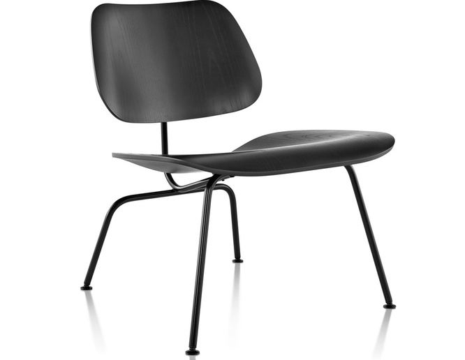
The Eames lcm molded lounge chair provides a sculptural presence when presented in black on black. http://hivemodern.com/pages/product1431/herman-miller-eames-lcmGreat
Great art inspires. Can you imagine how your day would start being greeted by this Frank Girard sculpture spotted on Design Sponge? http://www.designsponge.com/2013/07/a-modern-chicago-home-made-personal-through-design.html
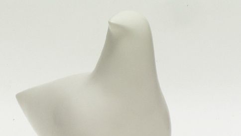
A Bird in the hand…
August 16, 2013
becomes a thing of beauty when reduced to its purist form. This sculpture by American artist Cleo Hartwig, created in the early to mid 60’s, illustrates this perfectly. It’s simplequietmodern at it’s best. Reproduced by her own company in white foundry stone, this Mid-century Modern gem may still be found from time to time. If spotted, my advice…grab it.